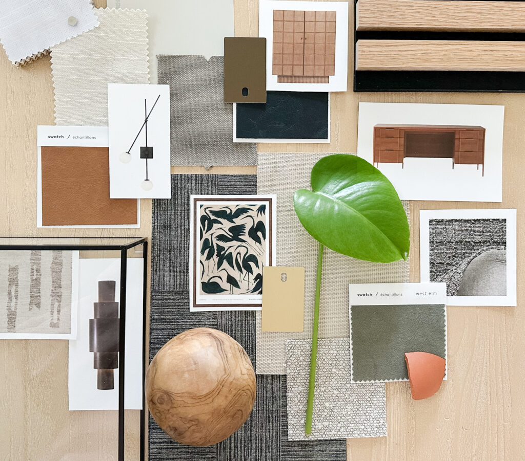
When it comes to interior design, color psychology plays a crucial role in transforming spaces and evoking emotions. Whether it’s the calming hues of blue, the energizing shades of yellow, or the sophisticated tones of gray, understanding color psychology in interior design can help you create an environment that not only looks stunning but also feels just right. This guide will explore how to choose the perfect color palette for your space and delve into the psychological aspects of color that make our homes sanctuaries of comfort and joy.

Understanding Color Psychology in Interior Design
Color theory is a body of practical guidance to color mixing and the visual effects of a specific color combination. It’s the foundation upon which artists, designers, and decorators build their masterpieces. The color wheel, developed by Sir Isaac Newton in 1666, is a pivotal tool in color theory. Here’s a quick overview:
Primary Colors: Red, blue, and yellow. These colors cannot be created by mixing other colors.
Secondary Colors: Green, orange, and purple. These are created by mixing two primary colors.
Tertiary Colors: These are created by mixing a primary color with a secondary color.
Understanding these basic principles allows you to create harmonious color schemes, whether they are monochromatic, analogous, complementary, or triadic.
The Impact of Color on Mood and Behavior
Colors significantly impact our mood and behavior, often in ways we aren’t consciously aware of. Here’s how different colors can influence the atmosphere of a space:
- Blue: Known for its calming and serene properties, blue can lower blood pressure, reduce anxiety, and promote a feeling of tranquility. It’s an excellent choice for bedrooms and bathrooms.
- Yellow: This cheerful color can energize and uplift the spirits. However, in large amounts, it can also be overwhelming. A soft, buttery yellow works well in kitchens and dining areas.
- Red: A stimulating color that increases energy levels and excitement. It’s perfect for social spaces like living rooms and dining areas but should be used sparingly in bedrooms.
- Green: Symbolizing nature, green has a soothing and refreshing effect. It’s versatile and works well in any room, particularly in spaces where relaxation is key.
- Gray: An elegant and sophisticated color that promotes a sense of calm and balance. Gray creates a neutral backdrop that allows other colors to stand out and can be used throughout the home.
- Purple: Often associated with luxury and creativity, purple can add a touch of sophistication when used in moderation. It’s ideal for artistic spaces like studios or luxurious areas like master bedrooms.
The Psychological Benefits of Color in Your Home
The right color palette does more than just beautify your home; it can also have profound psychological benefits. Colors can evoke feelings of happiness, calmness, and even healing. For instance, the cool and calming effects of blue can help reduce stress and anxiety, making it an excellent choice for bedrooms and relaxation areas. Yellow’s bright and cheerful nature can stimulate mental clarity and boost mood, making it perfect for workspaces and kitchens. Green is known for its restorative and harmonizing qualities, promoting relaxation and balance. By carefully selecting colors that resonate with you and your family, you can create a nurturing environment that supports mental well-being and fosters a sense of belonging and comfort.
How to Choose the Right Color Palette
Selecting the right color palette for your space involves more than just picking your favorite colors. Here are some steps to guide you:
- Consider the Room’s Purpose:
Think about what activities will take place in the room and the mood you want to set. For example, a bedroom should be restful and serene, while a home office should be energetic and inspiring. - Assess Lighting:
Natural and artificial light can significantly affect how colors appear. Test paint samples on different walls and observe how they change throughout the day with varying light conditions. - Start with a Focal Point:
Choose a statement piece, like a piece of art or furniture, and build your color palette around it. This approach ensures cohesion and harmony in your design. - Use the 60-30-10 Rule:
This classic interior design rule helps create a balanced color scheme:
60%: Dominant color (walls)
30%: Secondary color (upholstery)
10%: Accent color (accessories) - Don’t Be Afraid to Experiment:
Color is a personal choice, and what matters most is how it makes you feel. Don’t be afraid to experiment with bold colors and unique combinations until you find what works best for you.
Color Trends to Watch
While personal preference should always take precedence, being aware of current color trends can provide inspiration. Some trending colors this year include:
- Earth Tones: Soft browns, muted greens, and warm terracotta evoke a sense of nature and tranquility.
- Jewel Tones: Rich blues, vibrant emeralds, and luxurious purples add a touch of opulence and sophistication.
- Pastels: Soft pinks, light blues, and gentle lilacs create a soothing and inviting atmosphere.
Your Home, Your Canvas
Learning about how color affects our mood and how to use it to your advantage could be the game-changer you’ve been looking for and can help you transform your space into a haven of comfort and style. Whether you’re looking to create a peaceful retreat, an energetic workspace, or a welcoming social area, the right colors can make all the difference. By considering the purpose of each room, assessing lighting, starting with a focal point, and experimenting with different combinations, you can discover the perfect color scheme to elevate your home. Contact us. Happy decorating!
+ Show / Hide Comments
Share to: